photo contest

over9five

Moderator
Staff member
I have found if I email whatever photo to myself, then drag it over to my desktop, I can upload it from there. (macintosh) It is a little work, but what else do I have to do all day, besides work out?


And there's something else you can post pictures of!
 

moreluck

golden ticket member
Ummm.....I know Menotyou does not have one of those!
Oh, got it wrong, thought you were going to be posting. In that case, there's Nipple News, lessons in booby postings which is not to be confused with N.P.P.L. which is National Professional Paintball League.
 

Catatonic

Nine Lives
Sunrise on a foggy morning on Mormon Row in the Tetons.
Morman Row_4421_3HDR_Layered_web.jpg
 

moreluck

golden ticket member
Maybe you saw this painting of it before..................

Historic Barn, Mormon Row and Teton Mountain Range, Grand Teton National Park, Wyoming, USA


by Michele Falzone Item #: 6220465

michele-falzone-historic-barn-mormon-row-and-teton-mountain-range-grand-teton-national-park-wyoming-usa.jpg
 

DS

Fenderbender
That's really cool hoax,I see comparing the two that the roof has been redone and some new trees
have grown behind the building.History before my eyes.
 

satellitedriver

Moderator
That's really cool hoax,I see comparing the two that the roof has been redone and some new trees
have grown behind the building.History before my eyes.
DS,
One was the eye of the camera.
One was an artist eye view.
The artist balanced the painting using classic "taught" techniques and changed the surroundings to match.
Think of a see saw, weight over distance from a fulcrum point, both sides must balance.
Hoke's photo is "unbalanced" and used the technique of angles, to create "physic tension."
Hokes photo is far better.
Look at the painting, You see it all in one glance.
Look at Hokes photo and your eye has to look around at the details.
BTW;
I love the term "physic tension". I learned that term about the use of ziggurats in design when I had to bone up and teach a class in artist blacksmithing.


stevetheupsguy

sʇǝʌǝʇɥǝndsƃnʎ
DS,
One was the eye of the camera.
One was an artist eye view.
The artist balanced the painting using classic "taught" techniques and changed the surroundings to match.
Think of a see saw, weight over distance from a fulcrum point, both sides must balance.
Hoke's photo is "unbalanced" and used the technique of angles, to create "physic tension."
Hokes photo is far better.
Look at the painting, You see it all in one glance.
Look at Hokes photo and your eye has to look around at the details.
BTW;
I love the term "physic tension". I learned that term about the use of ziggurats in design when I had to bone up and teach a class in artist blacksmithing.

I would be so lost in a converstaion with you, Steve, though i am glad to know you, oh, and that your name is also, Steve, LOL.
 

over9five

Moderator
Staff member
Oh come on. There IS no comparison.

One person snaps a picture and walks away.
One person takes days to create that image.

I like the painting better.
 

moreluck

golden ticket member
You know, it was never suppose to be a conflict......Stug just wondered where he had seen that shot before and I wanted to help him. I knew it was a poster/painting many times over.
 

dilligaf

IN VINO VERITAS
Maybe you could drop the artist a note. That way she'll know that all that money spent on art courses was a waste and she could've just picked up a camera!!
Everyone has a right to there own opinion. Personally I prefer Hoax's photo. I would insert a smiley in here but I can't.


CHERYL!!!!! I'm going on strike until this is fixed. I NEED my comic sans and purple back.
 

menotyou

bella amicizia
Everyone has a right to there own opinion. Personally I prefer Hoax's photo. I would insert a smiley in here but I can't.


CHERYL!!!!! I'm going on strike until this is fixed. I NEED my comic sans and purple back.
Colon and right side of parentheses :)
 

Catatonic

Nine Lives
Interesting Discussion.
I don't see it as one being better than the other ... I think they are both good.
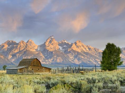
I certainly could not paint this scene, if for no other reason than I am not patient enough to paint it. I imagine this artist took 40 hours or more to paint that picture.

I did take a picture from further back across the road (barely see it in the painting) that looks a lot like the painting but like Sat said, I was going for the dominant foreground object (barn) with the supporting angle of the mountain range and the roof line. I also took time to make sure the peak of the roof and the Grand Teton lined up and supported one another. As Sat said, I used these elements to create tension in the photo ... never heard of "physic tension" but I imagine the concept is the same.

Another concept that Sat touched on is the "path" in the photo which leads the viewers eye into the image and I made sure I left room on the left so the viewer's eye will continue on up to the mountains.

The painting does use classic composition techniques of "eye of the rectangle" (barn and tree on the right) , linear lines on the thirds and color balance (yellow on blue).

One note in regards to a painter versus a photographer analysis - the painter starts with a blank canvas and adds only those elements that supports the composition while the photographer has to analyze the scene , walk around, move up and down vertically and think about the elements and where they appear in the frame to try and get a good composition from what is in front of them.
 
Top